
Selling the dream
By Gerard Richards
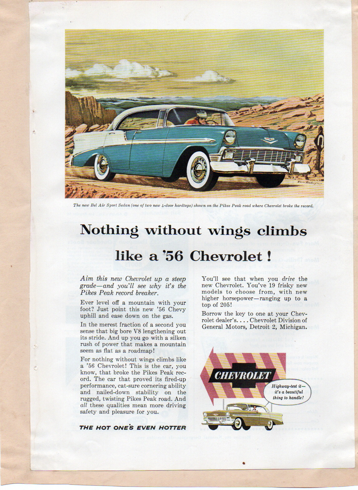
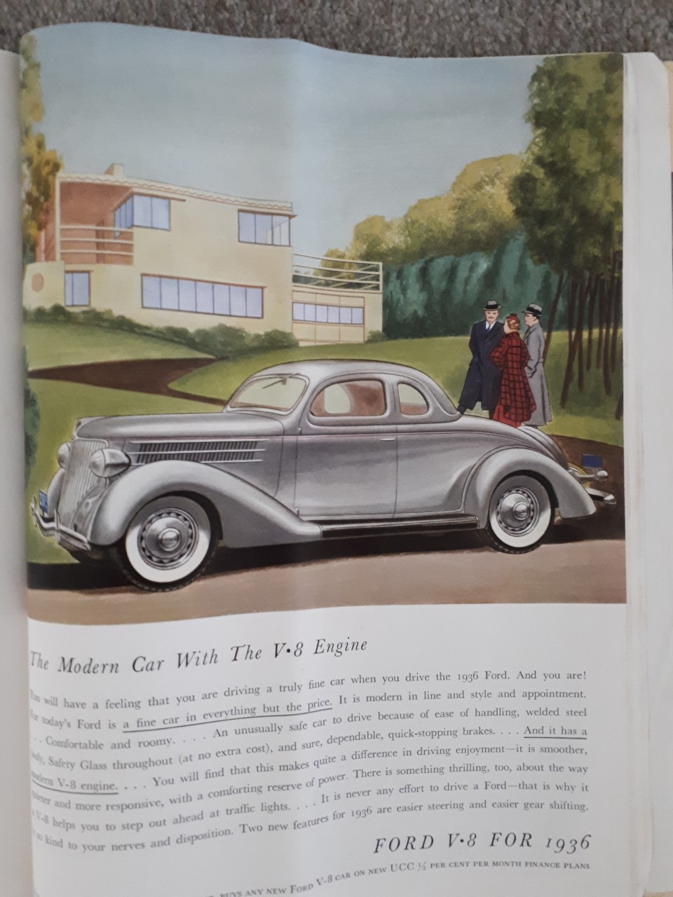
The glamour and excitement of the automobile first had an impact on me through car advertisements. Growing up on Auckland’s North Shore in the conservative early ’60s, there wasn’t much dynamic stuff going on. Everything was pretty bland and socially constrained, but there were glimpses of a world beyond that lay just out of our grasp. One of these early influences was a pile of late ’50s National Geographic magazines. We received these on subscription from a generous uncle in North America. It wasn’t the articles we were poring over though, it was the advertising, particularly the art-styled American car adverts.
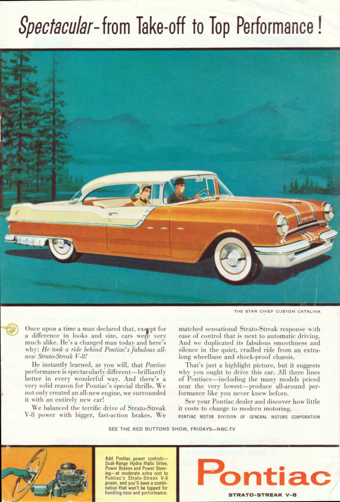
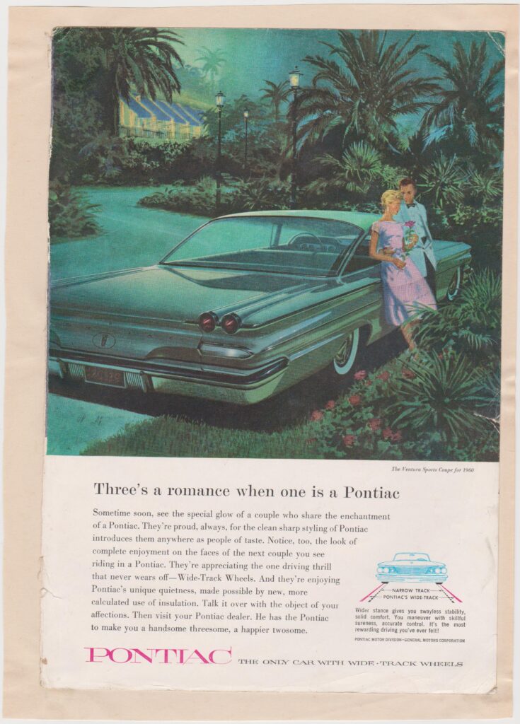
The evocative, lusciously coloured and boldly styled auto adverts hit me like a juggernaut. The cars were extravagantly stylised, mirroring America’s fascination with space rockets. The artists exploited fad to the max, depicting the cars’ aggressive long and low stance from exotic angles.
The scenes in the ads were always fun or exotic, and the people gathered around or in the cars were always reduced in size to emphasise the grandeur of the vehicle. The message was loud and clear — own this fine example of American auto design and engineering and your life will be filled with action, you’ll draw a super attractive wife and friends like a magnet, and you will be totally fulfilled. Who was I at age 10 to question this utopian American vision? I took it all at face value, and the allure of a hot set of wheels captured me with a vice-like grip.
What I didn’t appreciate until much later was the fabulous skill of the artists who conveyed these illusions. Long after the reality of the quality of these whale-like machines, with their archaic engineering, poor handling, and braking, destroyed my childhood fantasies, the potency of the cars has remained through the sensational art of the advertisements.
Years ago, I started collecting the best art examples of these adverts from the range of publications that featured them. National Geographic, Saturday Evening Post, Colliers, Esquire, and Life magazine were the leading candidates, among others.
The best of the artwork is truly fantastic, seducing the unwary and susceptible to the charms of these alluring machines, combined with the adman’s evocative text emphasising ballistic horsepower, rock-steady handling, and superb brakes. Oh, the shameful, blatant lies they told.
Evocative component names like Turbo Flite transmission, Rocket 88, Hydra-Glide, Strato Streak V8, Buick Roadmaster, Power Flite Auto Trans, Turbo Fire V8, Blue Flame, Spitfire V8, and the like reflected the era’s obsession with space and rockets, which was harnessed to convey a car’s out-of-this world performance.
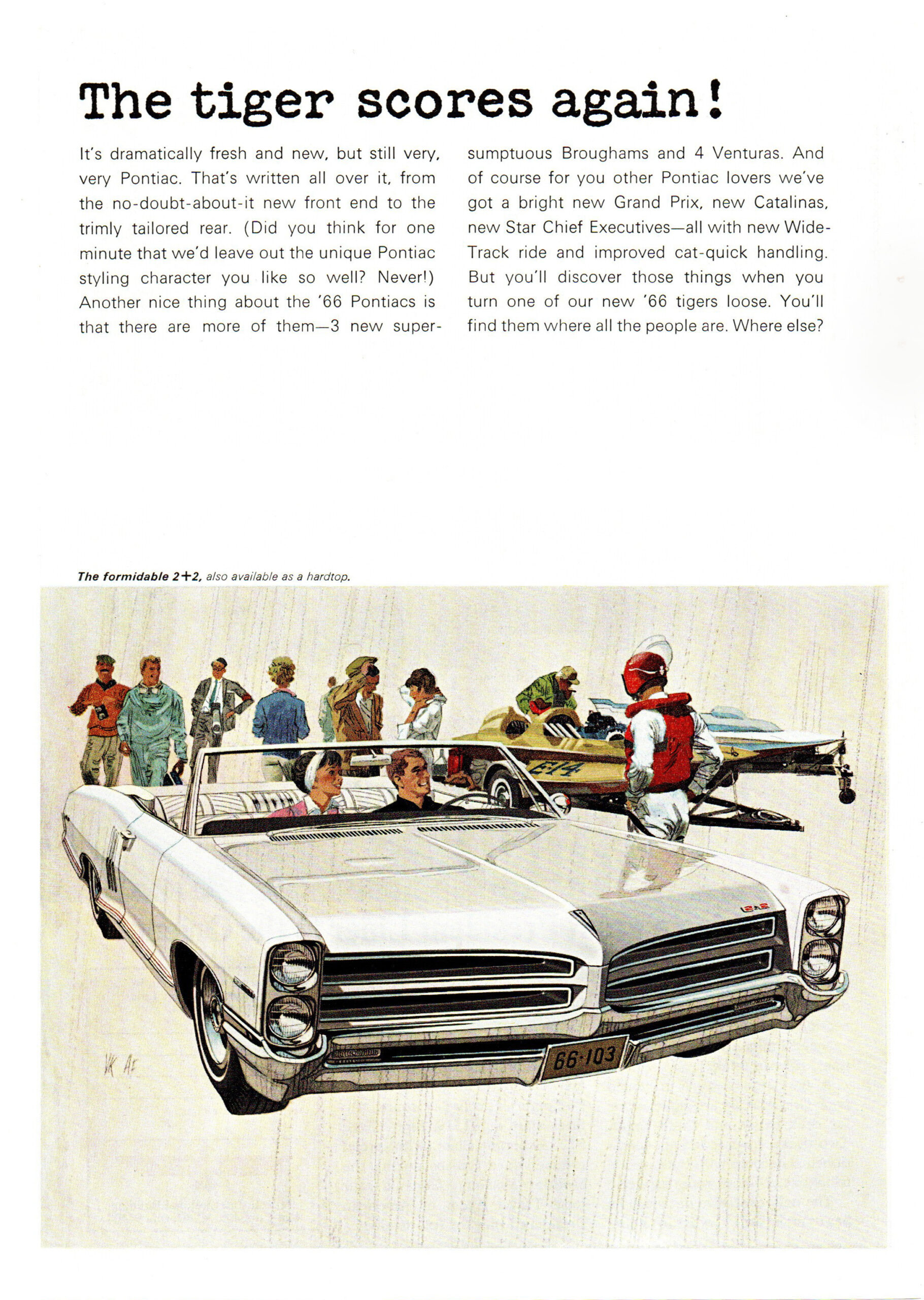
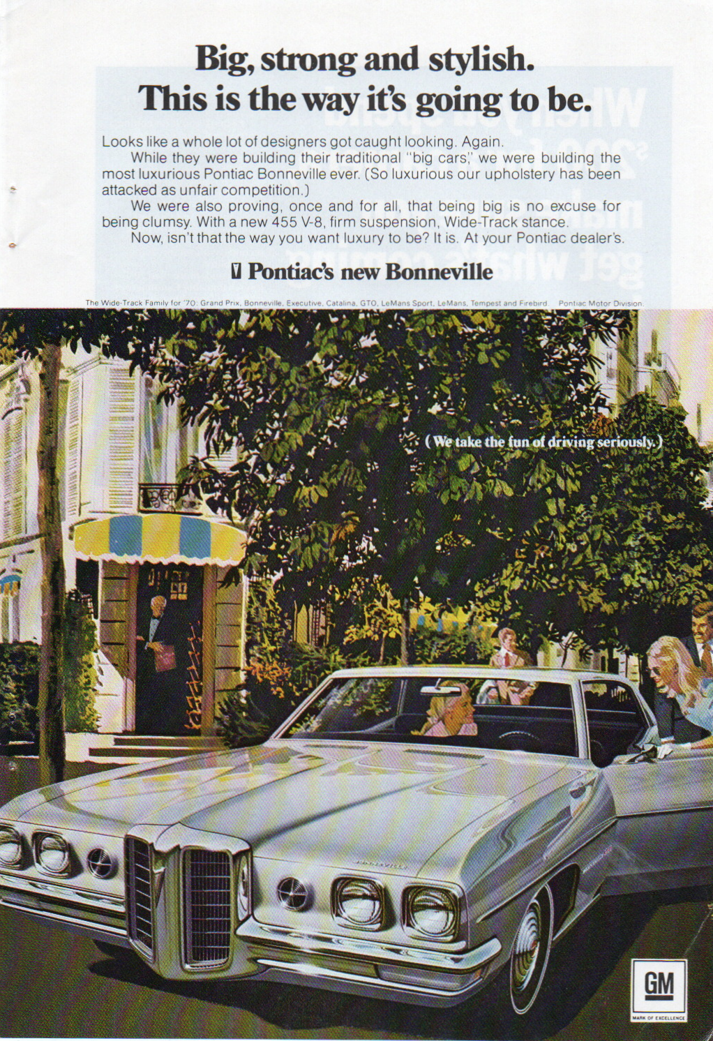
ART FITZPATRICK & VAN KAUFFMAN
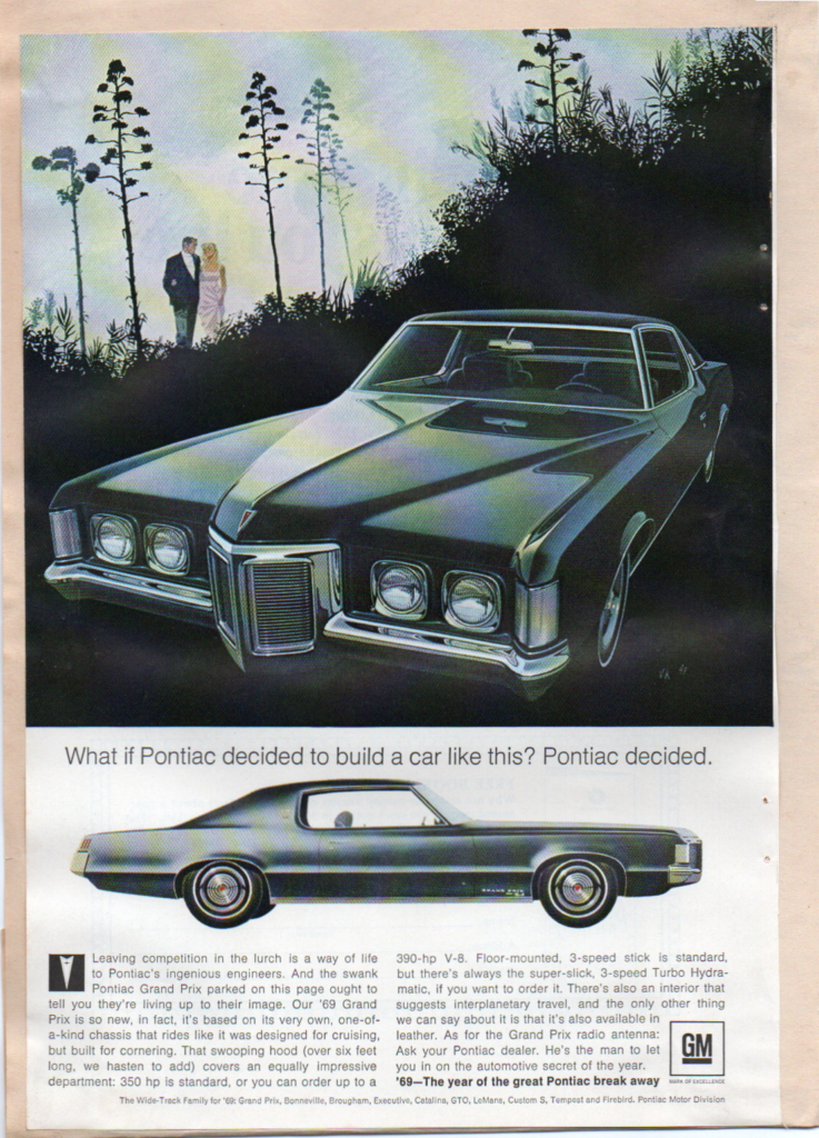
In my eyes, the very best practitioners of this art form were two guys named Art Fitzpatrick and Van Kauffman. Art Fitzpatrick had a long and fruitful history painting cars for adverts from around 1946, after previously working as a car designer for Chrysler, Lincoln Zephyr, Hudson, and Packard. Following World War II, he moved into painting car adverts, which paid more for an advert finished in a week than he earned in a month as a Detroit designer. By 1952 Fitz, as he was known, was working for Lincoln, Mercury, Nash, and Chrysler. In 1950, friend and fellow artist Van Kauffman began painting the backdrops for the Mercury account with Fitz doing the cars. This partnership evolved further when they got the Buick account in 1954, and the evocative and seductive style of their art reached new heights.
This came to fruition when they took on the Pontiac account in 1959, which coincided with the introduction of the ‘Wide Track’ model era. Pontiac had been languishing in the sales stakes, with a somewhat uninspiring model range. The combination of a more performance- related image and the pinnacle of art-based advertising from Fitz and Van sold the dream to the masses, and in the 1960s Pontiac sales surged.
For the enthusiast, their trademark initials AF/VK can be found in the margins of many of their classic pieces of Pontiac advert art.
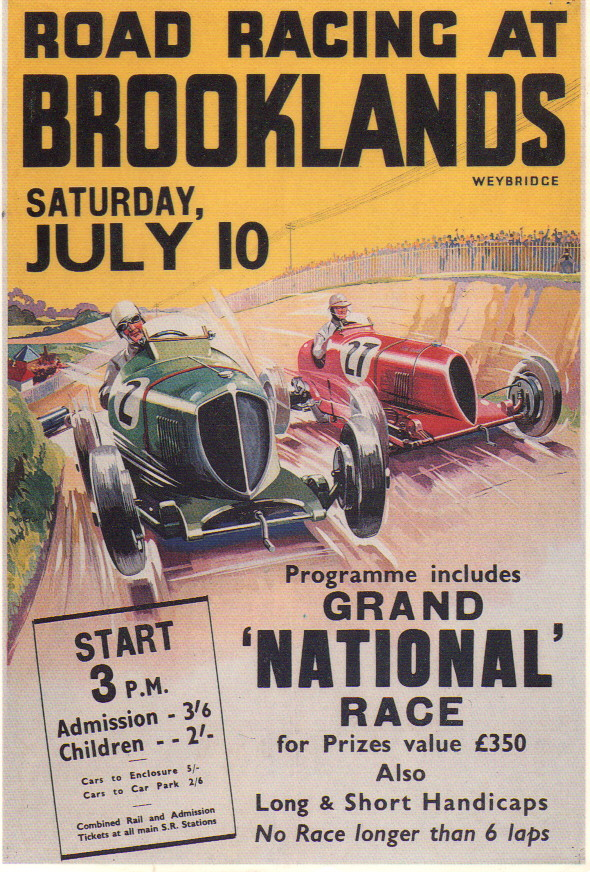
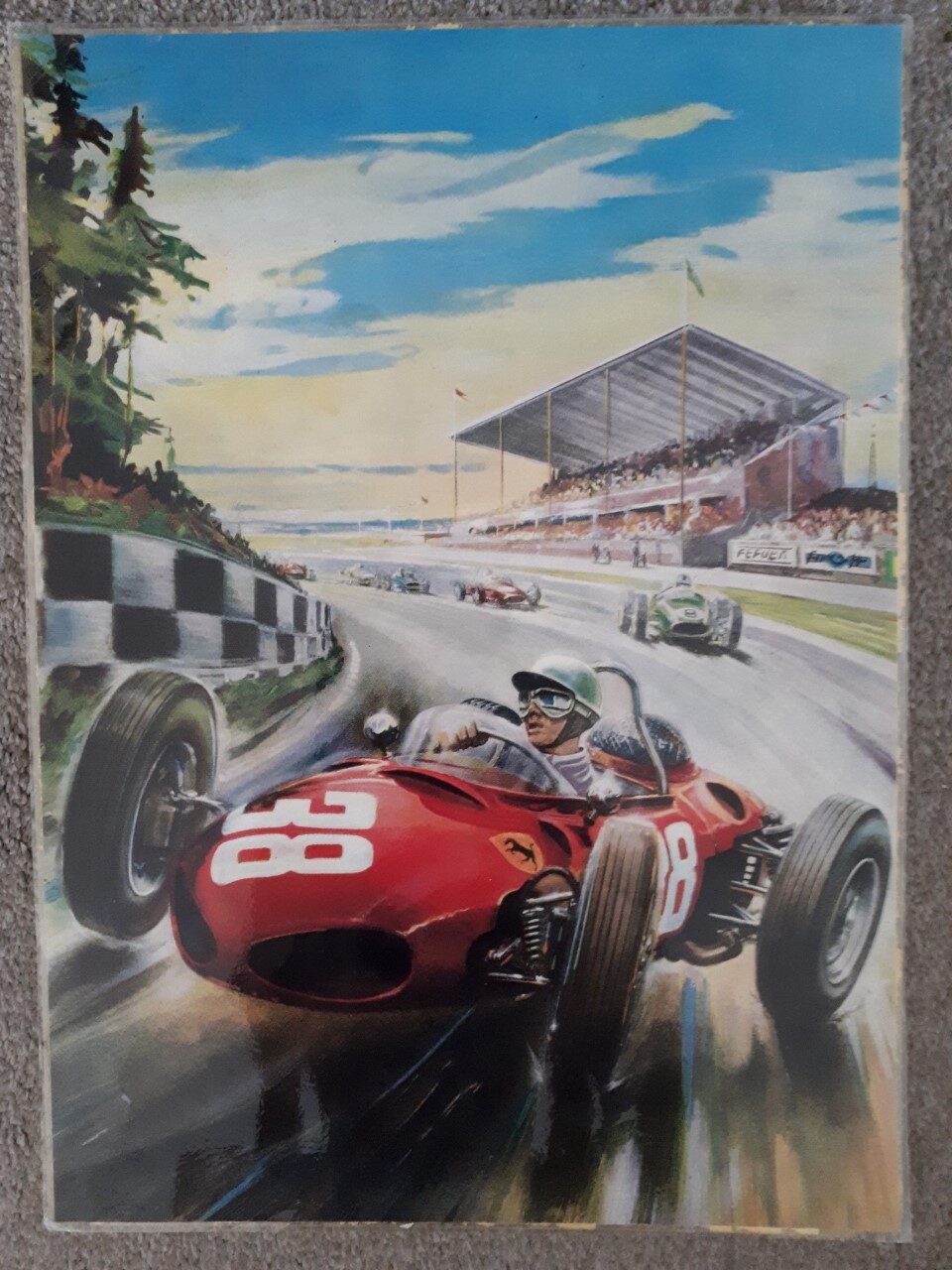
THE ART OF MOTOR RACING
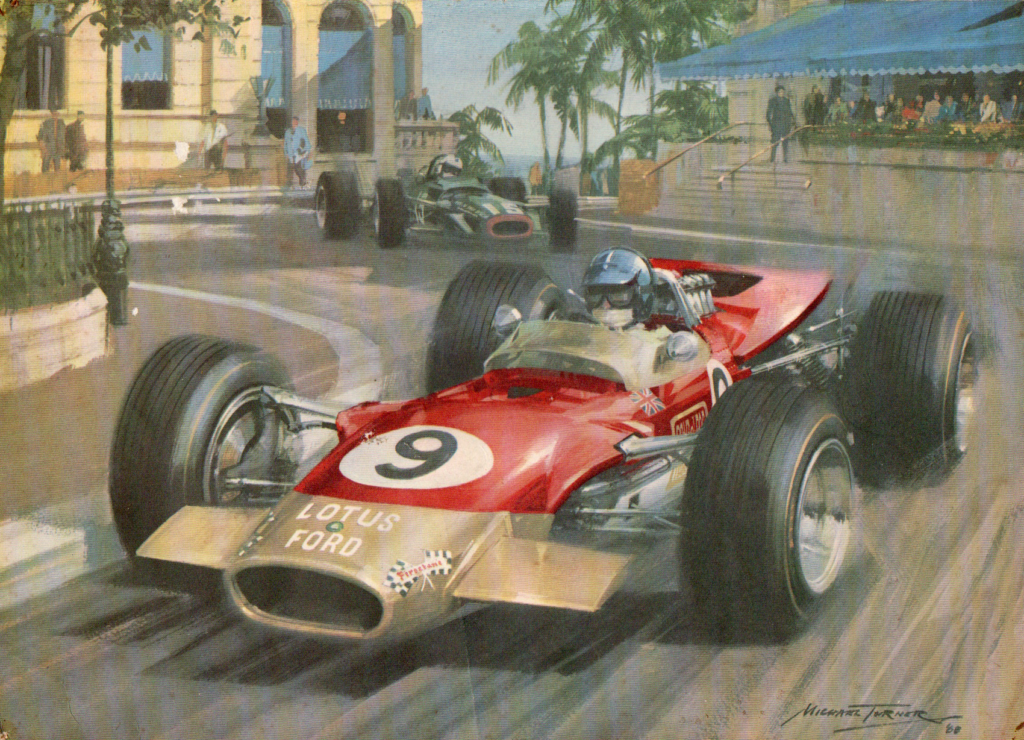
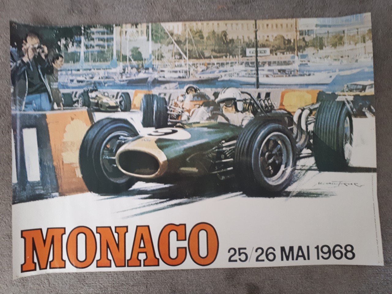
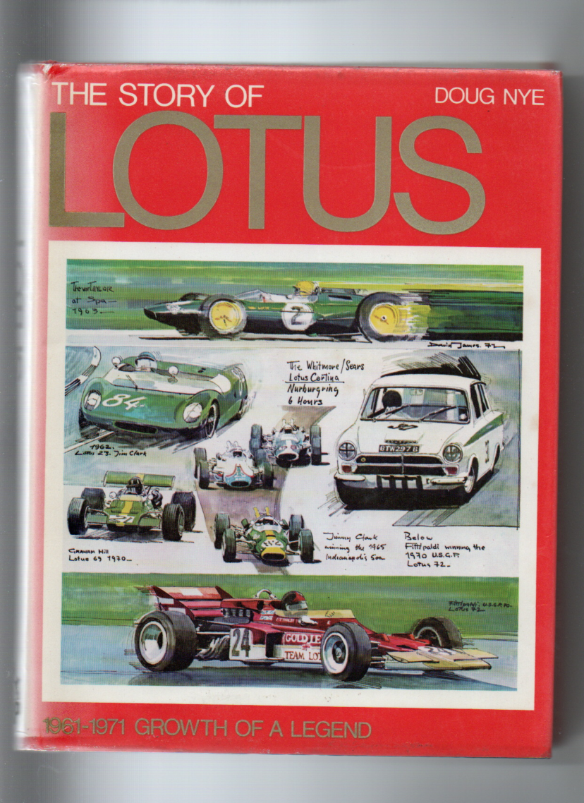
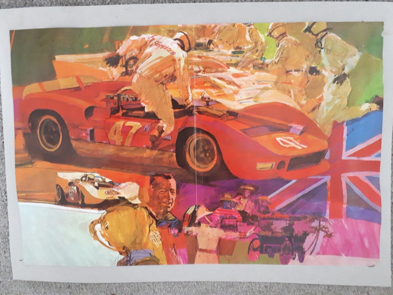
Motorsport art has been my other great passion. I was introduced to this around 1968, when a car-loving next door neighbour passed on to me one of the great Michael Turner small prints that were an extra in English Autocar and Motor magazines during the late ’60s. The image of Graham Hill hurling his red and gold Gold Leaf-sponsored Lotus 49 Cosworth through Casino Square, with Richard Attwood BRM V12 in hot pursuit, made a lasting impression.
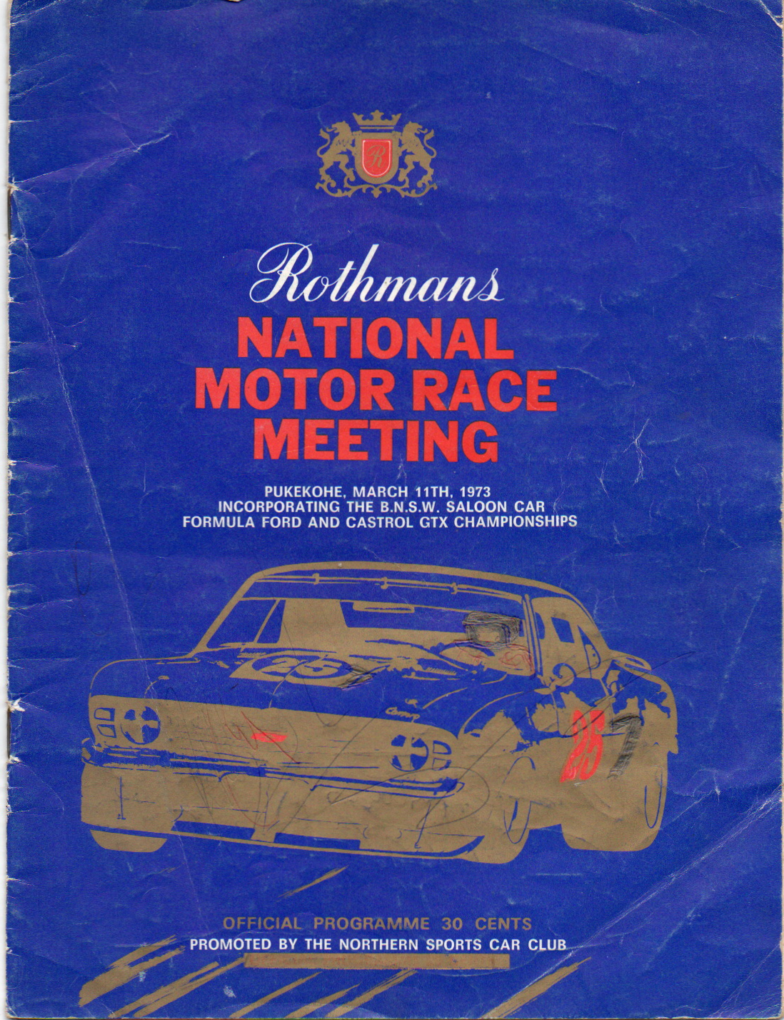
I still have it, although it went missing for many years, before being returned to me. What I love about this kind of art when it’s the calibre of Michael Turner’s work is the raw sense of wild action and danger that it conveys. And when I first saw it I was ripe for indoctrination — only the year before in March 1967 I’d attended my first motorsport meeting. It just happened to coincide with the swansong of the hairy All-comer saloon car category at Pukekohe. I was blown away by a half-hour Allcomers feature race that saw the legendary Custaxie of Robbie Francevic edge out the future, with a very narrow win over Paul Fahey’s ’66 Shelby Mustang. The Custaxie was overheating, and he only just made it home in front, but the near grandstand finish had me pumped with excitement.
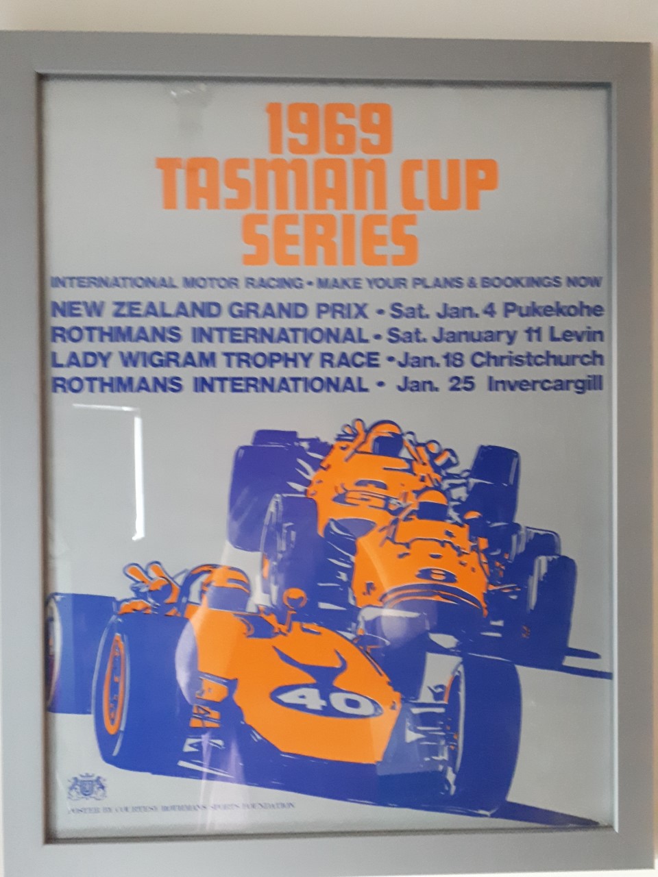
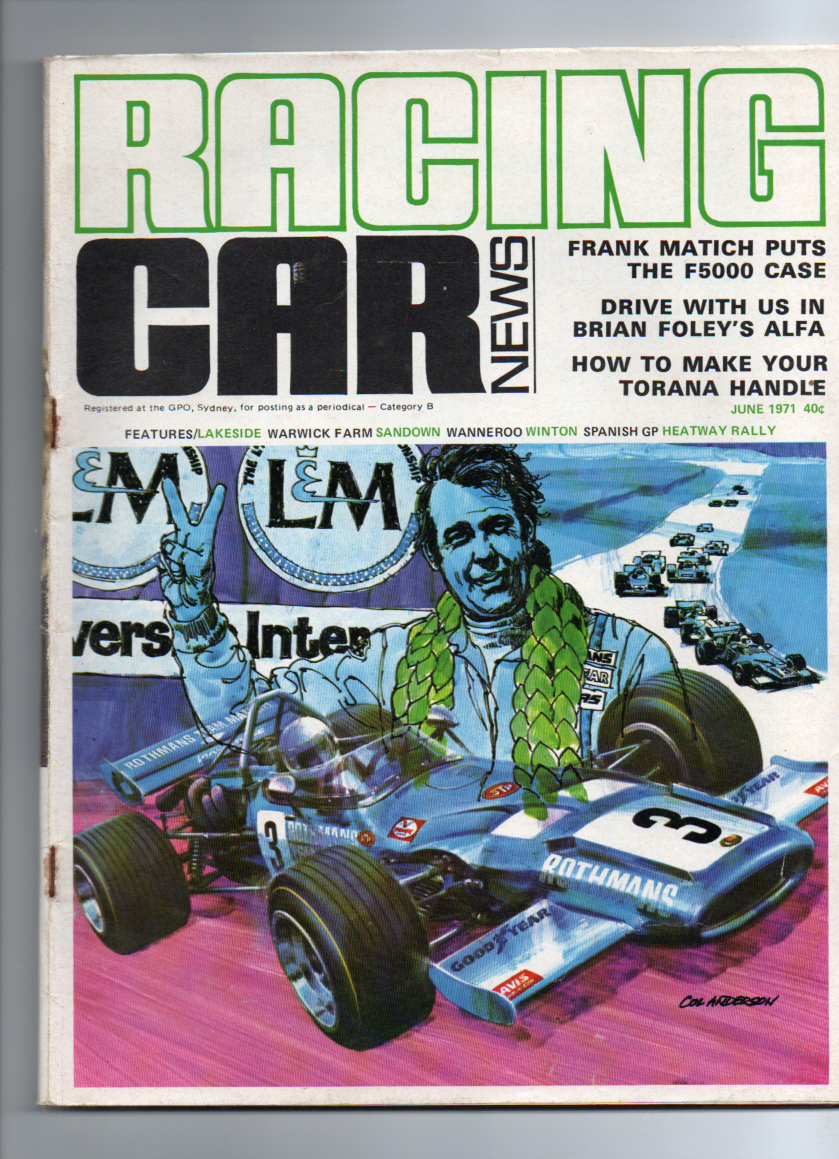
After that anything motor racing was totally on my radar. While there was nothing that substituted for the real thing trackside, my brother and I began collecting any signposts of this risky gladiator sport. Scrapbooks were all the go and any memorabilia of waging war on asphalt or dirt in the world of motor racing that we stumbled across in newspapers or random mags got severed, and stuck in. I still have the original scrapbooks from these years, which were given away, but miraculously returned a few years ago. They were enlightening to revisit 35 years later, and an accurate gauge of our obsession as petrol heads, with some fascinating artwork, stickers, programmes, adverts, and other treasures.
LEGENDS OF KIWI RACE TRACK ART
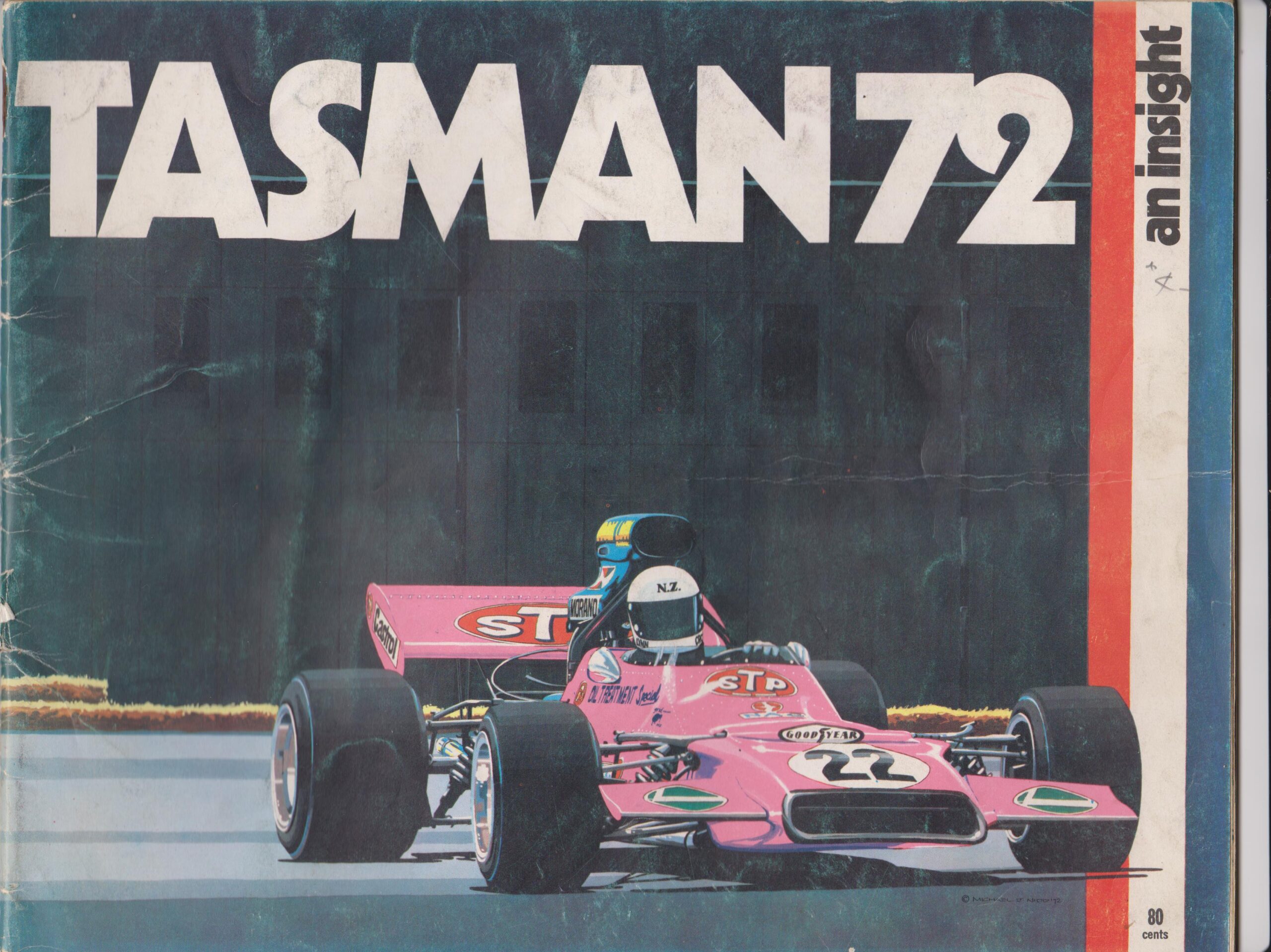
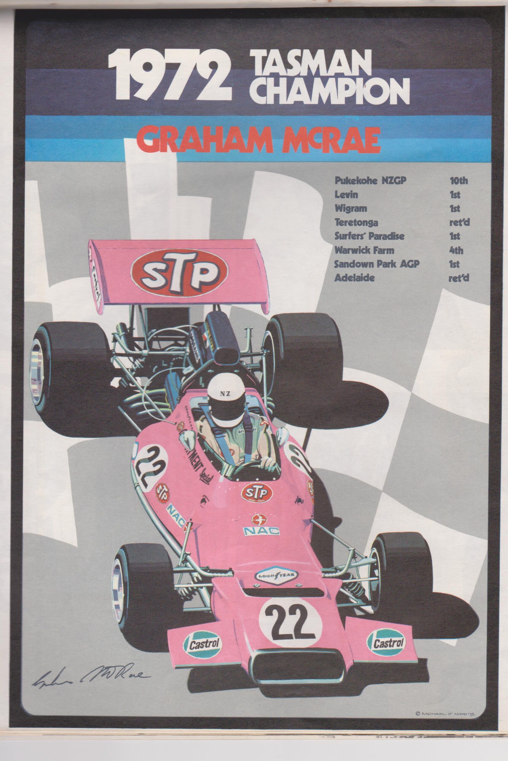
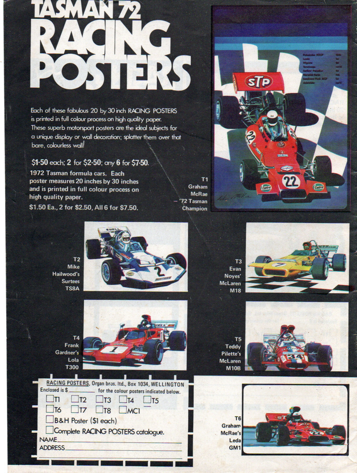
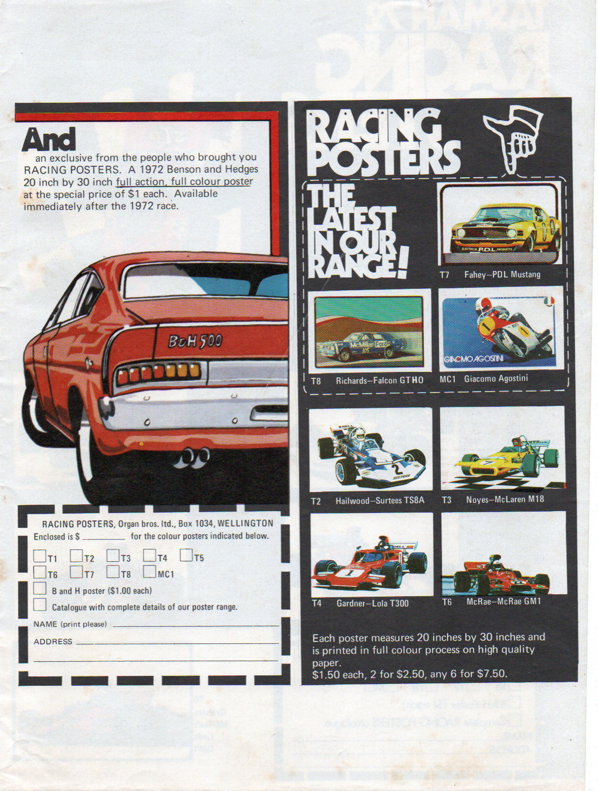
Among them were some adverts drawn by the great Kiwi motor racing artist Michael J. Nidd, which are displayed here. Nidd’s style was different from Michael Turner’s work, but his shading, attention to detail, and surreal colour was second to none. His bold, almost Day-Glo-style colour when combined with his drawing technique was so stunning. He didn’t use the hurtling car style to convey speed, unlike many others such as Turner, but his work was just as effective. I once owned a couple of these back in the day, but they unfortunately became casualties of time.
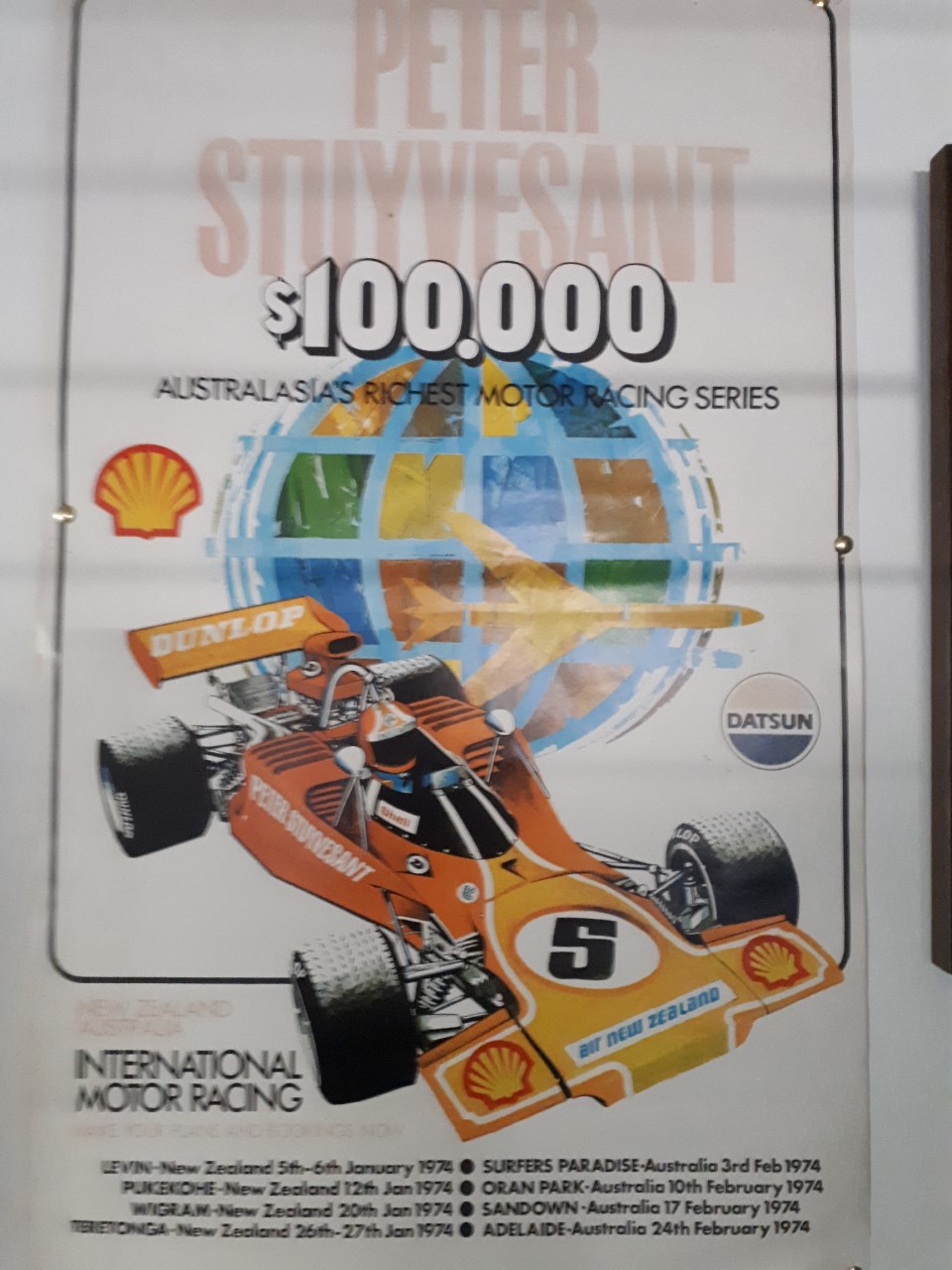
Michael’s commercial motor racing poster art was most readily available around the early to mid 1970s. He was also involved with a booklet combining his art with Terry Marshall’s photography, titled Tasman ’72 — An Insight. Some of his most memorable pictures were of Graham McRae and other Tasman Series racers, along with some saloons. I still have a 1974 Tasman Series (Peter Stuyvesant Series) promotional poster of his, with Lola T300 art.
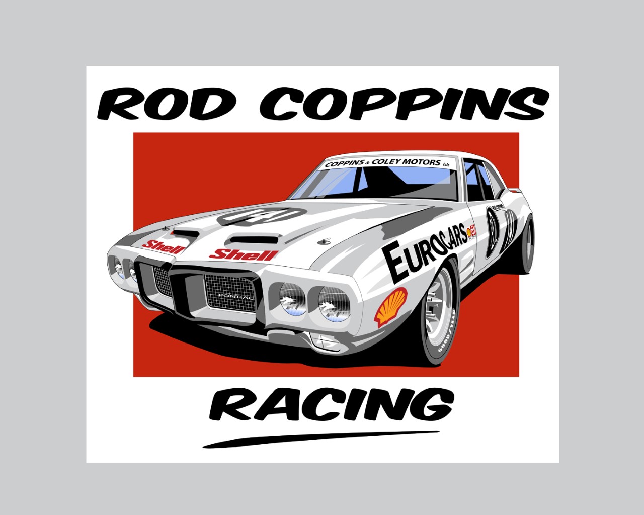
Other New Zealand motorsport artists that have made a strong impression on me are Kieran Roberts, Don Packwood and, to a lesser extent, Dennis Brown.
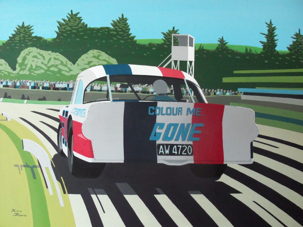
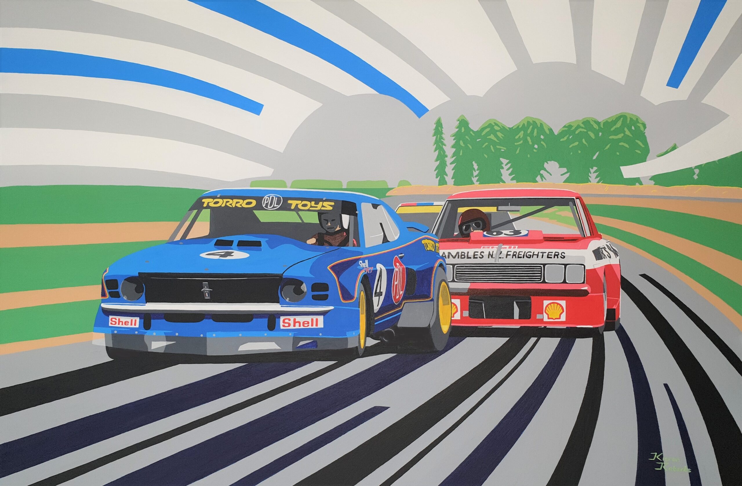
Kieran Roberts is the youngest of this brigade and probably my favourite. He works with a slightly surreal style, in some ways reminiscent of Michael J. Nidd, but with a distinct flavour of his own. I love his bright colours and layered silhouette-like backgrounds. The action is conveyed without necessarily the raw emphasis suggesting speed, with cars streaking along and tyres throwing up debris, etc.
A couple of my favourites are reproduced here with Kieran’s kind permission. They are the famous ‘Custaxie’ (Colour me Gone) of Robbie Francevic at Levin season 1966-67, and ‘Thunder at the Bay’, with Leo Leonard PDL Mustang and Jack Nazer Victor Chev at Bay Park 1975-76.
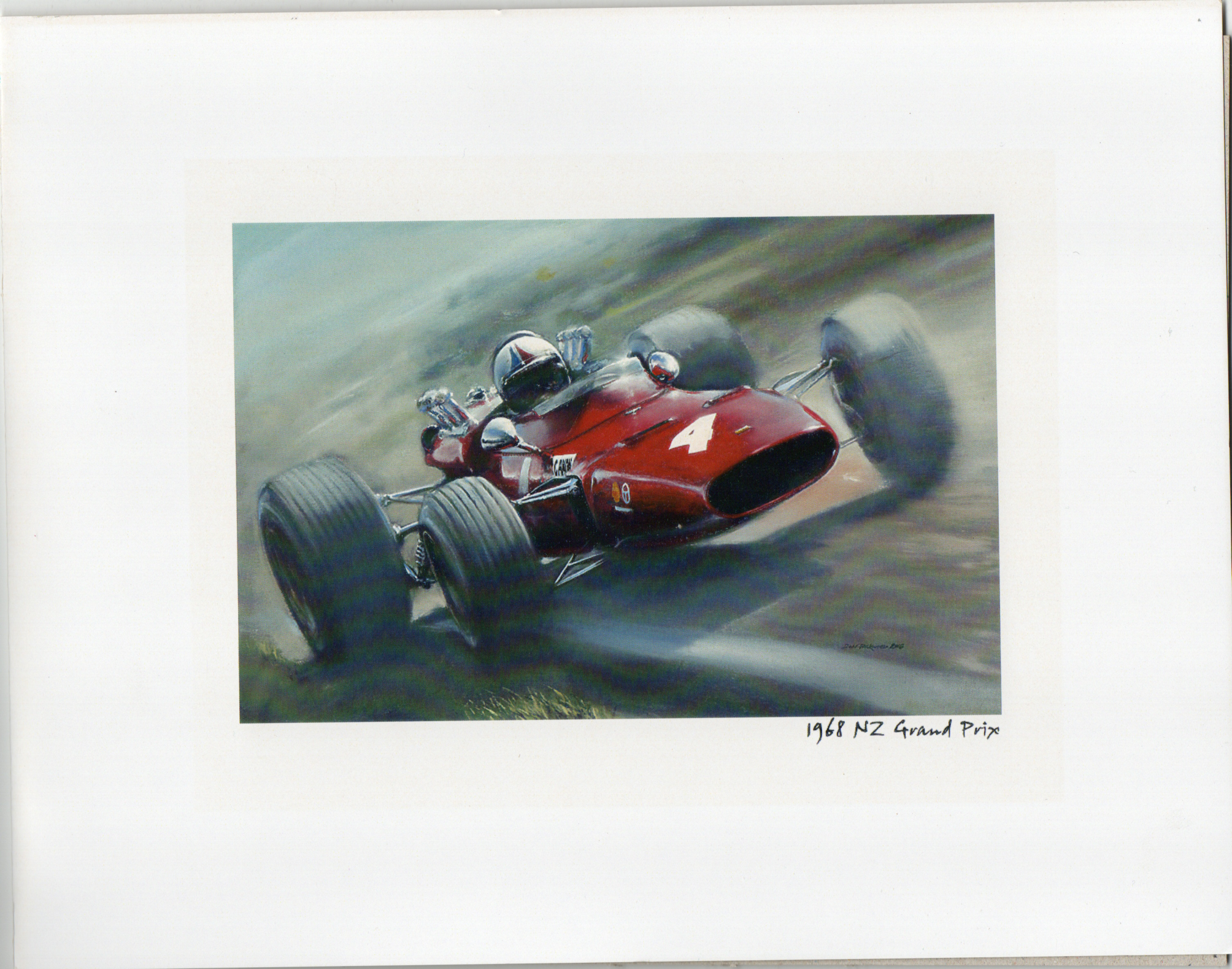
Don Packwood’s style in my opinion leans more to conveying the raw danger and violence of motor racing, and he does it well. In some ways his technique reminds me of Michael Turner. He is also a general automotive painter, among other subjects. His passion for motorsport painting stemmed from childhood visits to motor racing meetings at Levin. As a child growing up in the Wairarapa, he had golden memories and powerful impressions from the family pilgrimages to the circuit in the 1960s, which led to his desire to recreate them. I have one of his nice little prints of Chris Amon’s winning Ferrari 246T at the 1968 New Zealand Grand Prix. It is a gorgeous example of conveyed speed and blood-red colour as Amon brushes the edge of the kink in Pukekohe’s back straight. I was there that day and that car made an indelible mark on my consciousness, which this artwork conveys perfectly.
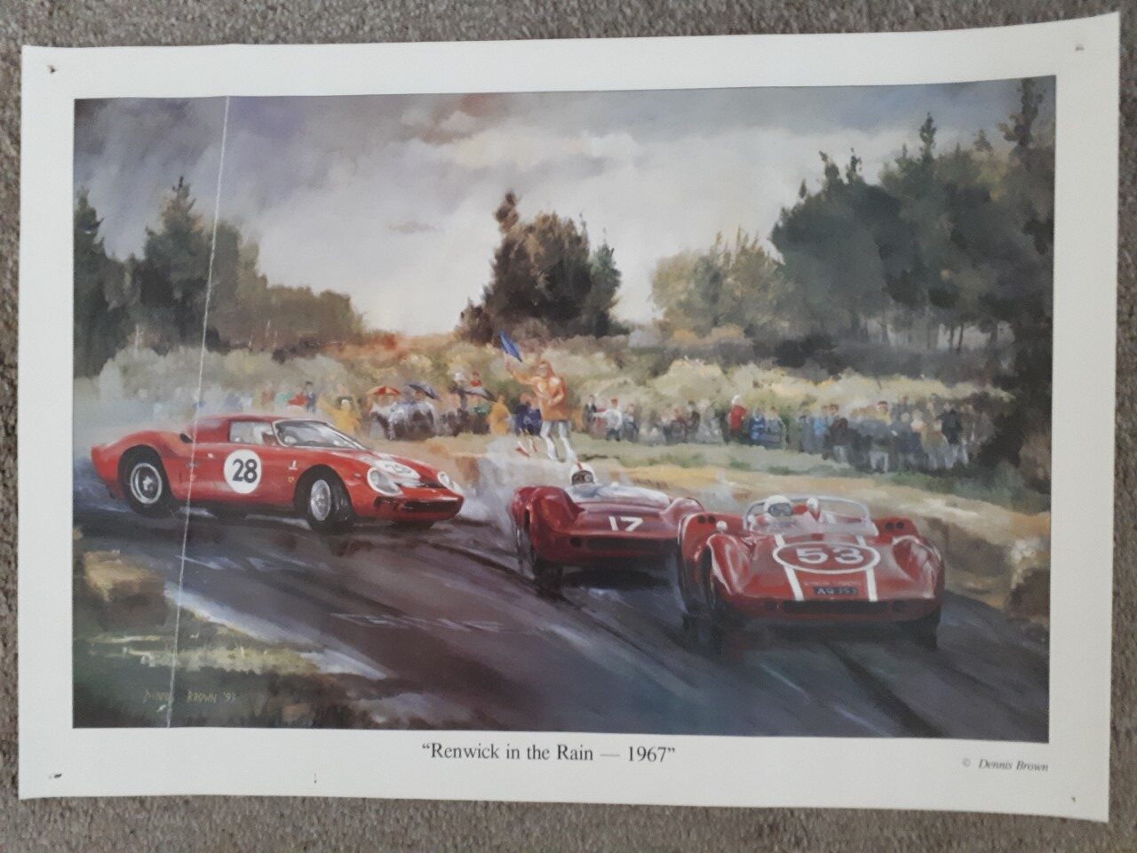
Dennis Brown was probably the first of the new breed of New Zealand motorsport painters after Michael J. Nidd. His work appeared in the 1980s and it was great to see a new artist enter the field. More traditional in style, he sometimes seemed to have issues with proportions, and occasionally I thought the backdrops looked a little amateurish. His style is less bold, though still colourful. I have a nice print of his of the sports car race at the last Renwick Meeting in November 1966.
There will be other Kiwi artists I don’t know about, who deserve mentioning of course, but as this is a personal odyssey, I’m only targeting those whom I’ve crossed paths with. The same goes for international artists.
But a quick mention of UK artist Dexter Brown wouldn’t go amiss. We had a book of his back in the ’60s and his work left a strong impression. Along with Michael Turner, he was a major player in the 1960s/70s, though his style was radically different but highly effective. He used a slightly distorted boxed-type technique, which made the cars appear slightly opaque, but the result was intriguing. His work appeared on many race programs and posters, as did Turner’s.
AUTOMOTIVE ART CURIOS
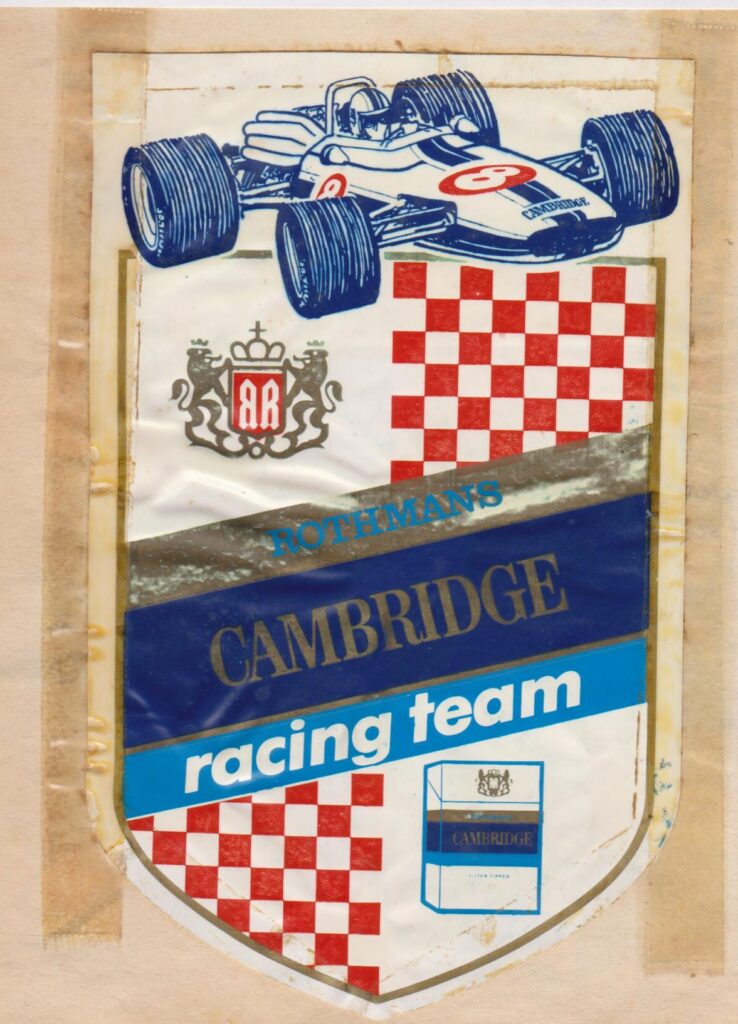
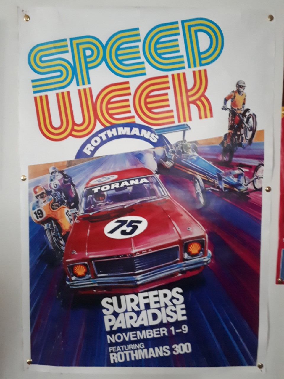
My fascination with auto and motor racing art spreads across many mediums. Book and magazine covers, posters, records, postcards, jigsaws, race programs, stickers, etc, are all fair game. Over the years, I’ve picked up quite a bit of this flotsam and jetsam. Some have floated away, like the legendary and optimistic PD L1 Mustang racing sticker ‘Electric Blue at 180mph’, the beautiful Rothmans Team Lexington sticker, and the wonderful Michael J. Nidd art of Paul Fahey’s Boss Mustang poster from 1972. However, the glass is half full as I still have pieces like the Rothmans Cambridge Racing Team sticker from 1969-70, and genuine March and Embassy Graham Hill Formula One stickers from the early ’70s. Throw into that a Parmalat Brabham Formula One jersey from the 1979 German Grand Prix, and all is not lost.
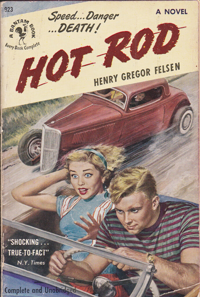
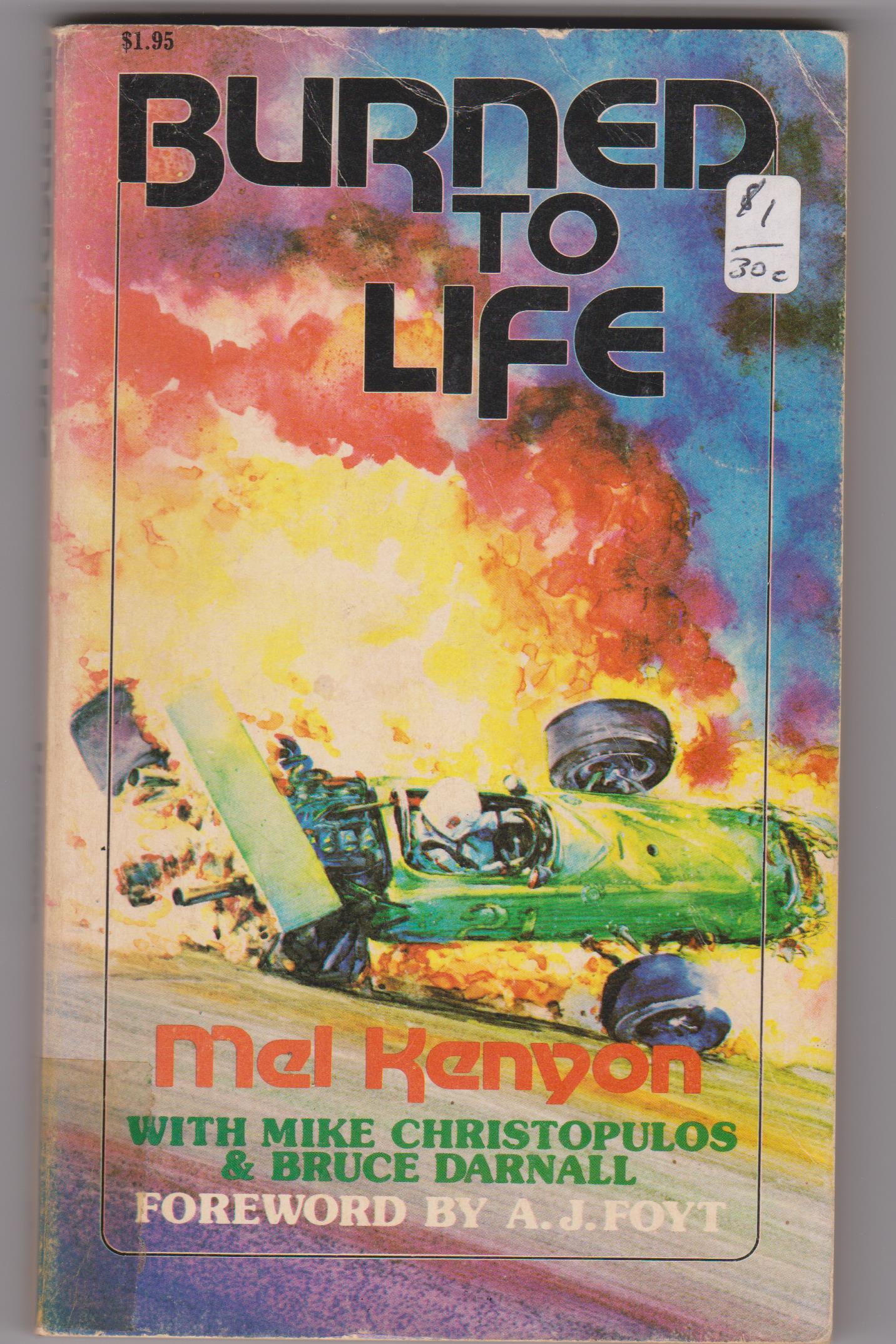
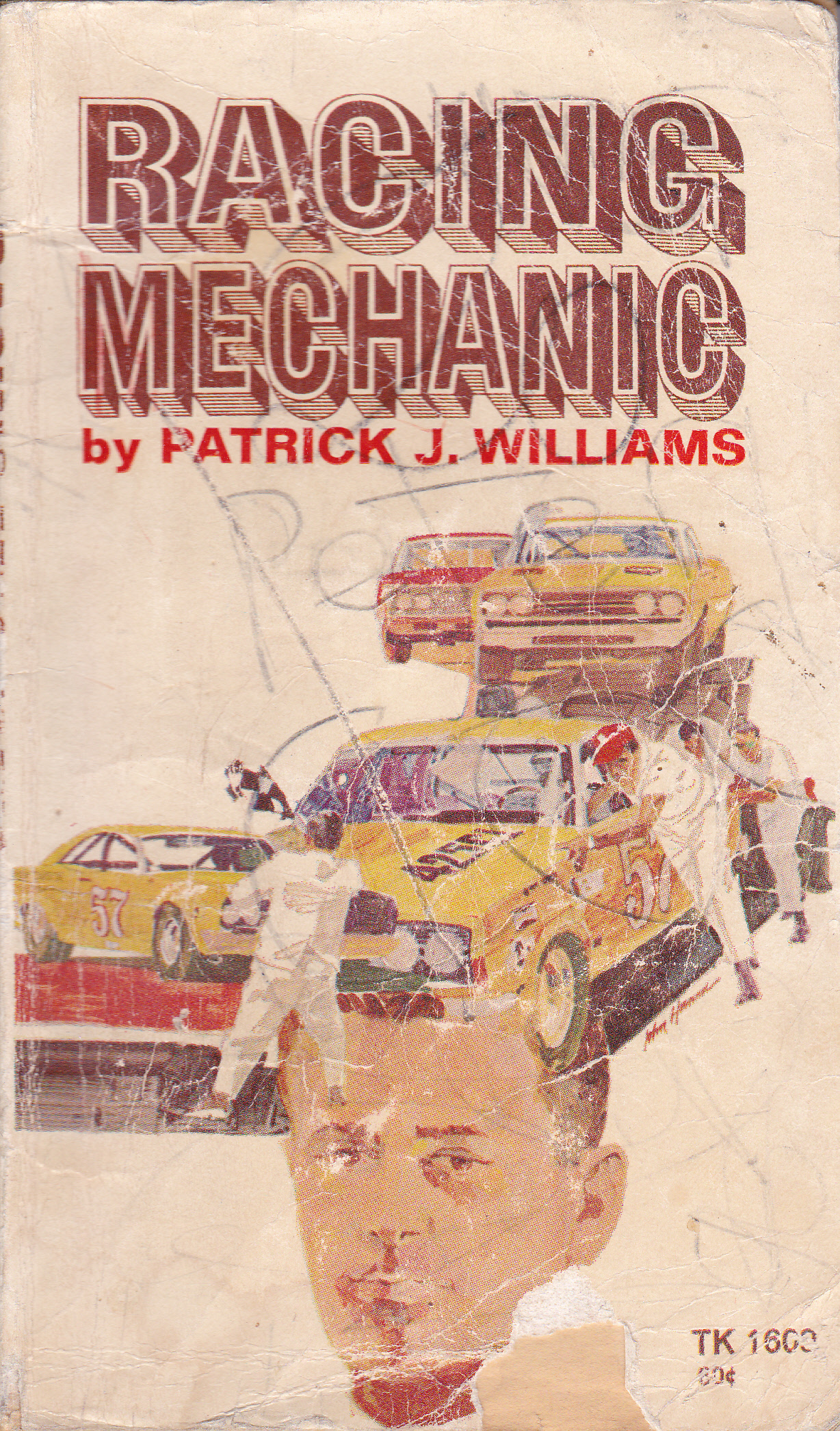
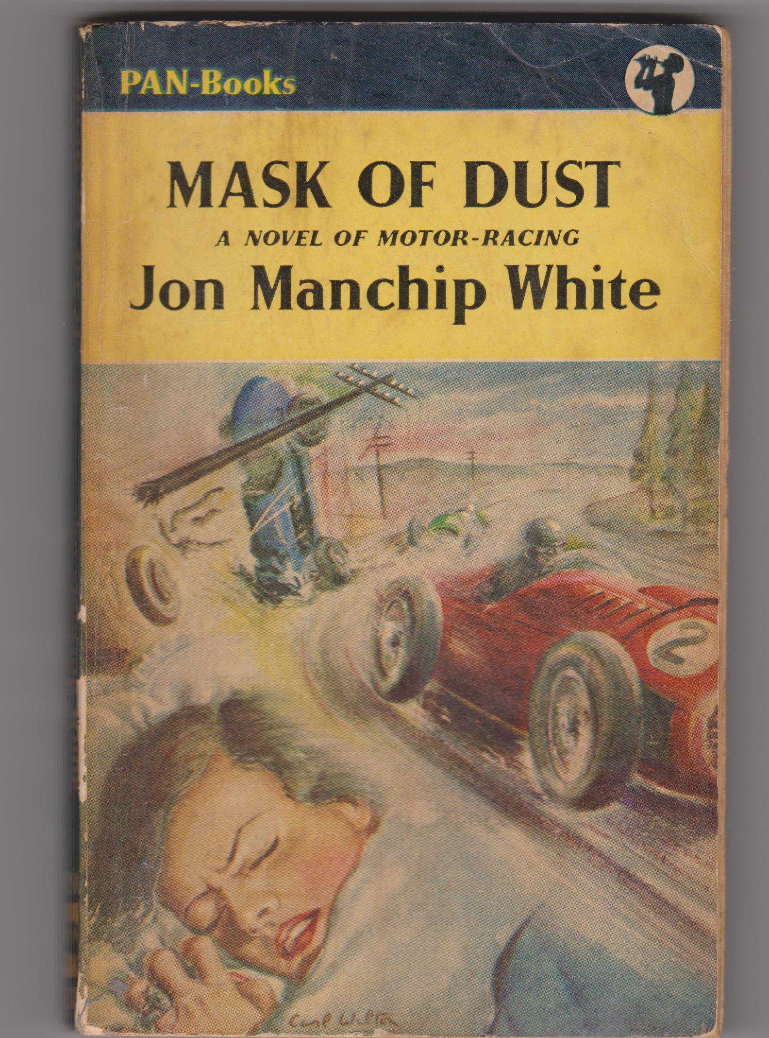
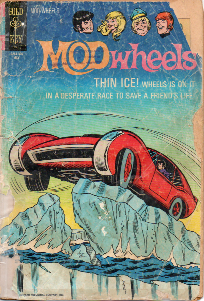
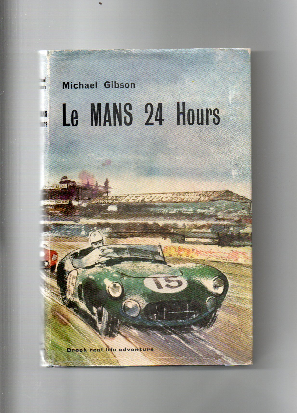
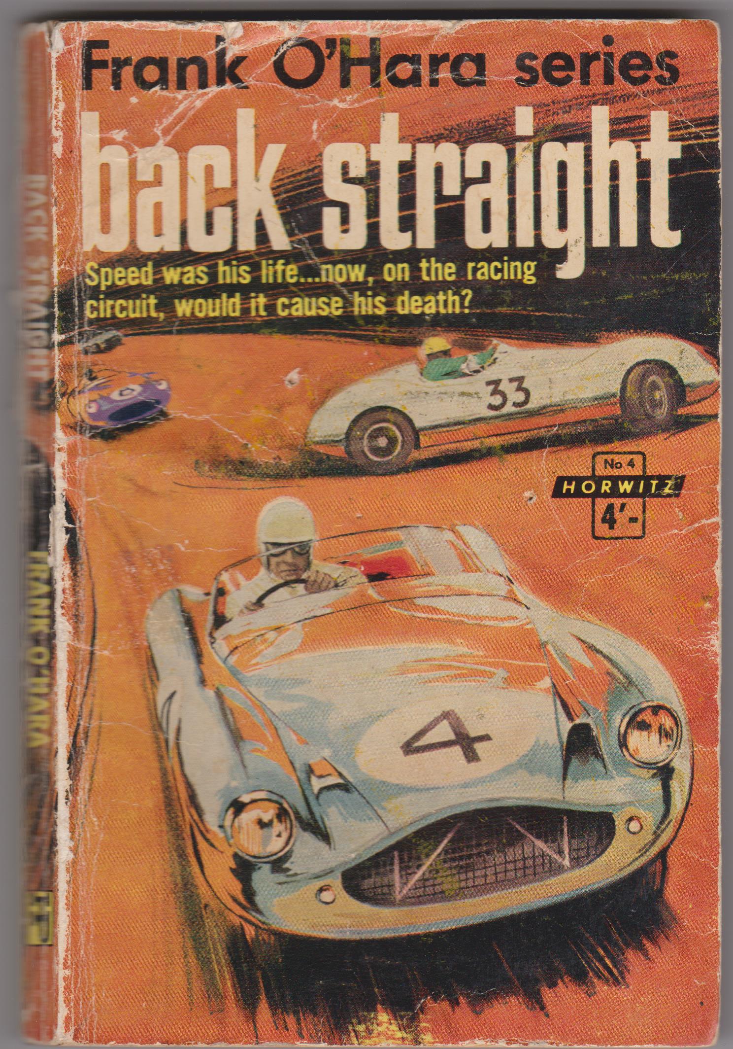
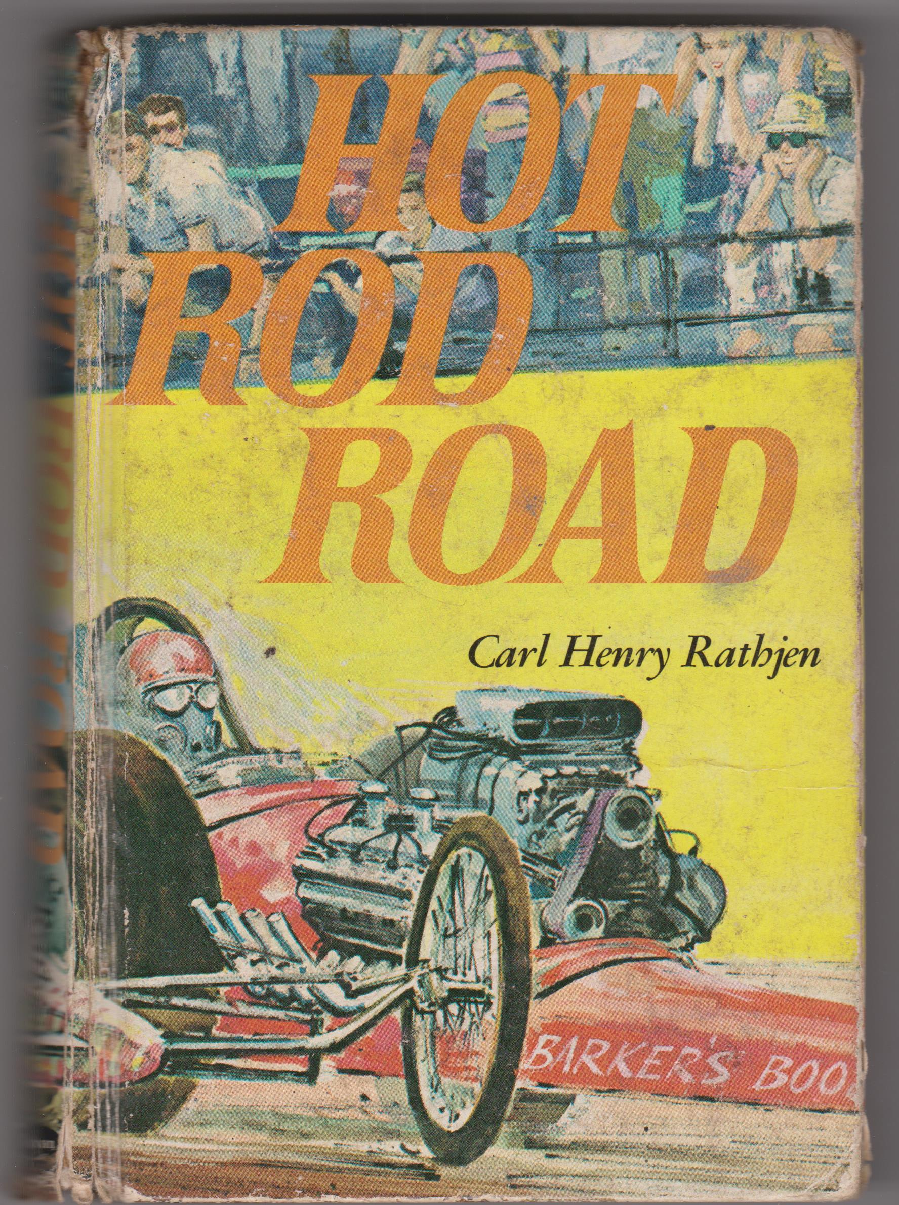
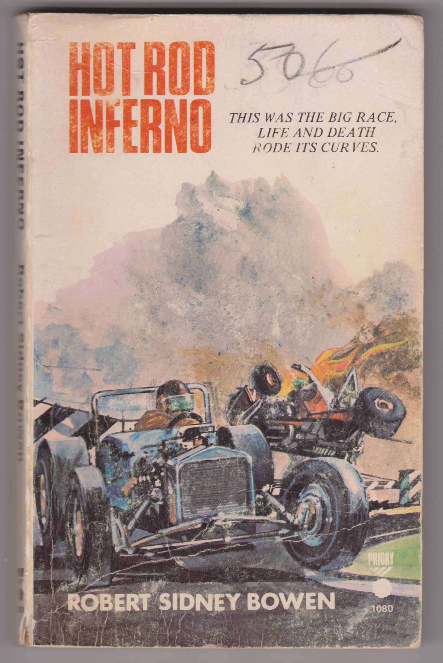
Some of my favourite ones though are the cheap paperback motor racing novels of the 1960s and ’70s, plus the Boy’s Own annuals that often had lurid motor racing covers and stories, like the Tiger, Lion, Valiant, and Eagle annuals. The script for most of these novels, stories, comics (like Skid Solo from Tiger magazine), and Boy’s Own annuals usually followed a well trodden path. A typical trashy story went along the lines of our young heroic driver being sabotaged by the ugly, greedy manager of his rival underhand driver, who can’t win by fair means. Skullduggery happens on the track, derailing our hero into the boondocks. Then they figure it out, our top-gun driver deals with the scumbag driver, who of course crashes in his attempt to run our hero off the track. The golden boy goes on to win the Big Race and the police are waiting at the finish line to apprehend the villains.
Obviously, these stories are not meant to be read now, but the cover art is to die for on most of these books and mags.
HOT ROD ART
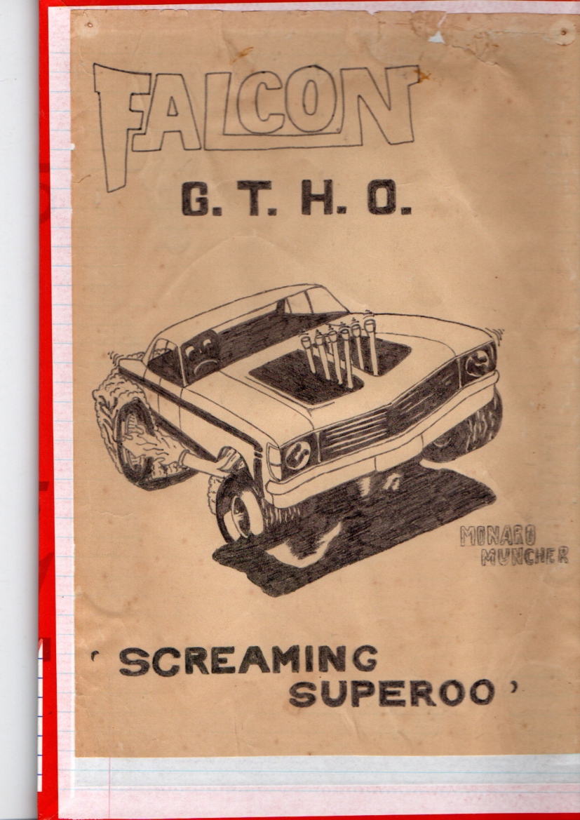
An arena I haven’t really touched on here, although it definitely warrants a mention, is hot rod art in all its wacky, gaudy glory, which cast a powerful spell on us as well. Ed ‘Big Daddy’ Roth, an American high priest of hot rod culture and creator of some of the most iconic original hot rods, like Beatnik Bandit and others, was also a consummate artist. His ‘Rat Fink’ comics, posters, and T-shirts unleashed a whole new genre of hot rod art. Others included Custom Car Kings of radical car reshaping, painting, and pinstriping, such as George Barris (Barris Kustoms) and Von Dutch.
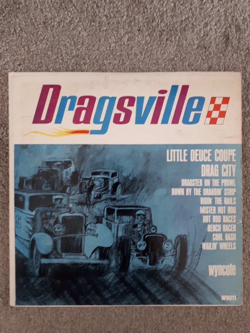
There was a huge market for the spin-off of this exploding hot rod passion with youth. Cool comics, hot rod music, books, T-shirts, posters, etc, went viral on a world stage. The Beach Boys, Jan and Dean, and other Southern Californian bands went a long way towards selling it.
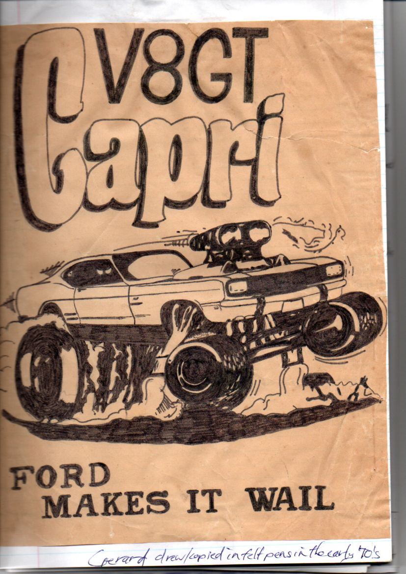
Though much of it was hard to get in New Zealand, some of it made it here. I have kept a few treasured paperbacks and albums, plus a couple of my own attempts at hot rod art from the early ’70s. Brothers Rob and Owen Campbell, the former editor of NZ Hot Rod Magazine for many years, produced some of the most exquisite home-front New Zealand hot rod art from the 1950s and ’60s. These have only recently resurfaced in the public spotlight when they featured at a Te Papa Exhibition and were republished lately in NZ Hot Rod mag. Originals of these would be absolutely primo for your garage.
GREATEST HITS FROM MY COLLECTION
Here’s a possible top 10 from the Richards’ archive of peak examples of automotive/racing art from my collection over the years. They’re not in any particular order:
Shark nose Ferrari 156, Phil Hill, Tiger Annual 1963, artist unknown
Vauxhall Firenza advert from Car and Car Conversions magazine 1972, artist unknown
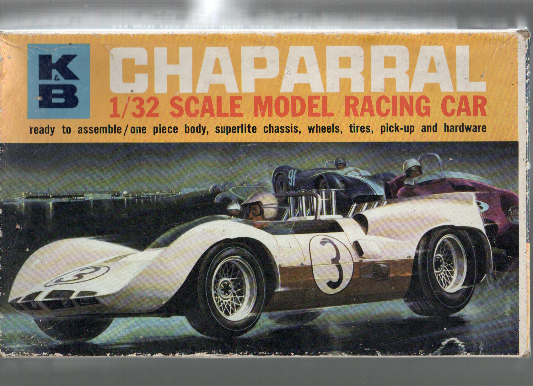
KB Chaparral slot car box art, artist unknown
Scarab on cliff top road, cover of Climax magazine November 1961, artist unknown
Custaxie Robbie Francevic at Levin 1966-67, artwork by Kieran Roberts
1968 New Zealand Grand Prix Chris Amon Ferrari 246T, artwork by Don Packwood
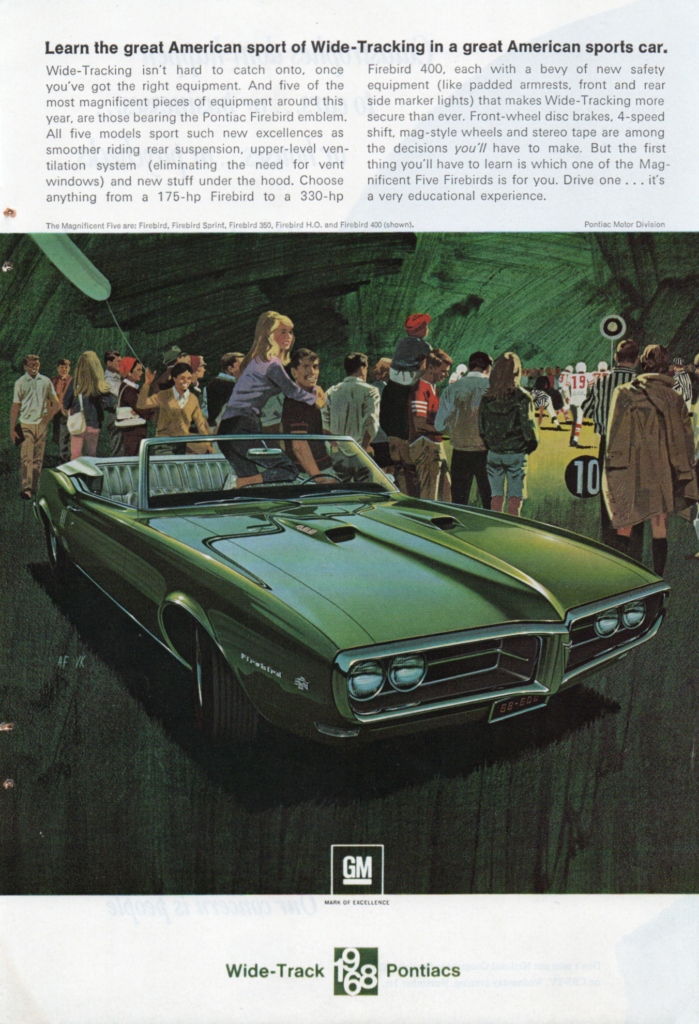
Pontiac Firebird 1968 advert, artwork by Art Fitzpatrick and Van Kauffman
Graham Hill Lotus 49 Monaco 1968 art print, by Michael Turner
Graham McRae Leda GM1 Tasman Series 1972, art by Michael J. Nidd
Hot Rod (paperback), by Henry Gregor Felsen, Bantam 1951, artist unknown
I like automotive art because the great paintings and drawings are almost larger than life. The fantasies — be it new automobiles of a previous era, or motorsport — reveal their most exotic potential, regardless of whether or not this was actually realised. Photography just doesn’t have the same licence to fuel the imagination.